The Art of Effective Poster Design: A Comprehensive Guide for Graphic Designers
In the vibrant world of graphic design, poster design stands out as a unique medium that combines artistry with communication. A well-crafted poster has the incredible power to convey messages, evoke emotions, and inspire action, all within a single frame. As graphic designers, understanding the intricacies of effective poster design can transform our ability to connect with an audience and amplify our creative expression.
The Intersection of Art and Design
Poster design is where art meets design, merging creativity with intent. Unlike traditional artworks, posters must communicate clear messages while being visually captivating. This duality presents an exciting challenge: how do we create something that is not only aesthetically pleasing but also functionally effective?
At its core, successful poster design tells a story. Every element—from the choice of color palette to typography and imagery—serves a purpose. It’s a visual narrative that guides the viewer’s eye and provides clarity. Embracing this narrative aspect is essential for any graphic designer aiming to create standout posters.
Key Principles of Effective Poster Design
1. Clarity and Simplicity
One of the fundamental aspects of poster design is clarity. Viewers often only glance at a poster for a few seconds, so it’s crucial to make a strong impression quickly. Aim for simplicity in your design; avoid overcrowding the layout with excessive text or graphics. The central message should be easily readable, which means clear fonts and a clean composition are vital.
2. Visual Hierarchy
Creating a visual hierarchy helps guide the viewer’s eyes across the poster. Use size, color, and placement strategically to emphasize the most important elements, such as the event title or a call to action. A well-structured hierarchy can turn a chaotic design into a cohesive and engaging story.
3. Color and Emotion
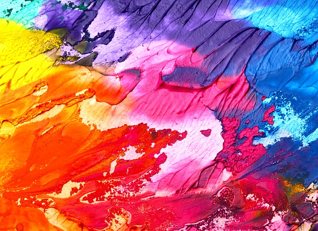
Colors are powerful tools in poster design as they evoke feelings and set the tone of your message. Choose a palette that resonates with the theme of your poster. For example, vibrant colors can generate excitement and energy, while softer tones may evoke calmness or nostalgia. Understanding color psychology can be a game-changer in how your audience perceives the design.
4. Typography Matters
The typography used in poster design is just as critical as the visual elements. Fonts can convey personality and tone, reinforcing the message behind the poster. Experiment with different typefaces, but ensure they complement each other. Hierarchy should also be maintained through varied font sizes and styles.
5. Balance and Composition
A harmonious balance in composition ensures that no single element dominates the poster and that all parts work together cohesively. Utilize techniques such as the rule of thirds or symmetry to create a balanced visual layout. This harmony will enhance the viewer’s experience, making them more likely to engage with the content.
Inspirational Poster Design
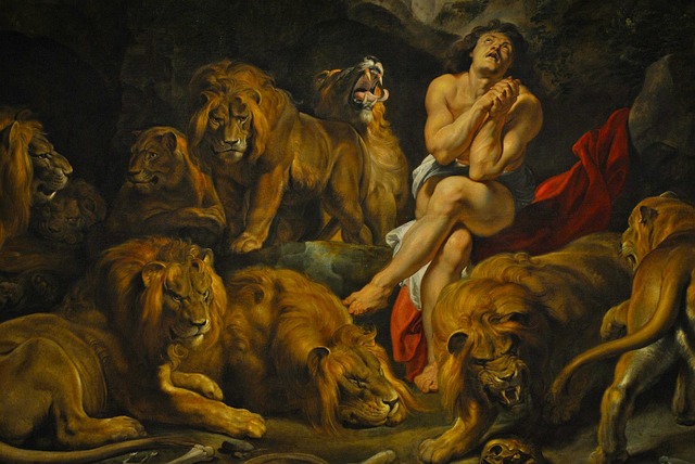
Many renowned artists and designers have made their mark through iconic poster design. From vintage movie posters to modern event flyers, studying these manifestations of creativity can inspire new ideas and techniques. Dive into the past and examine what makes specific designs memorable; this exploration can enrich your own design philosophy.
As graphic designers, the journey of mastering poster design is both challenging and rewarding. By blending artistic intuition with strategic design principles, we can create compelling visual narratives that resonate with audiences. Embrace the art of poster design, and watch your creative potential unfold in vibrant new ways.


