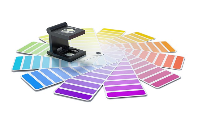
When we think about photography, it’s easy to associate it with the click of a shutter or the sharpness of a lens. But there’s a more profound element that often shapes the entire visual impact of a photograph—color. A color sample can take on a life of its own in the world of photography, transforming an ordinary image into a work of art. It’s not just about hue or saturation; it’s about emotion, story, and design. Through careful selection and use of color samples, photographers wield the power to evoke feeling, communicate mood, and guide the viewer’s eye across the image.
In the realm of art, colors have long been understood as emotional language—blues that hum sadness or calm, reds that scream energy or passion. Photography channels this language in every frame. A rich golden light settling on a cityscape at dusk, or the bold primary colors that create drama in a fashion shoot, can both become iconic simply through a well-composed color sample. These color choices are never accidental; they are part of the photographer’s palette.
From an art perspective, color sampling is a technique that helps photographers interpret and recreate emotional content. Whether inspired by classic paintings or modern media, photographers often study historical art to extract palettes that resonate with people’s subconscious. The result is not just an image, but an experience—one that invites the viewer into a certain space or time. In that sense, the art of photography borrows heavily from traditional disciplines of painting and design to tell nuanced stories.
Meanwhile, the influence of design in color sampling cannot be understated. Graphic design principles, such as contrast, harmony, and balance, play a central role in composing images. A photographer who understands design will know how to construct a frame where the color sample supports the subject and context. For instance, in product photography, color sampling determines the mood and even perceived value of the item. Cool, neutral palettes might suggest sophistication, while bright, saturated bursts can convey youthfulness and energy.
A well-chosen color sample also builds consistency in a photographer’s portfolio. It creates a visual signature, something that becomes recognizable to viewers and clients alike. Think of the moody, desaturated tones in cinematic photography, or the pastel-drenched worlds of minimal still life images. These are choices born not just from aesthetics, but from a deep understanding of branding and visual communication—principles rooted in both art and design.
Digital tools today have made color sampling more accessible than ever. Whether you’re using eyedropper tools in editing software or exploring preset color palettes, it’s easier to experiment and refine your photographic voice. However, the true power of a color sample comes from intention. It’s about knowing what story you want to tell, what emotion you want to evoke, and what visual balance your image requires.
Much like a painter dabs their brush into a carefully mixed tone, photographers too can use color sampling to breathe life into their compositions. Whether you’re shooting portraits, landscapes, or abstract textures, start by identifying how color supports your vision. Observe the world not just in shapes and shadows, but in hues and gradients. Take note of how natural light alters a scene’s emotion, or how a splash of unexpected color can shift the narrative of your photograph.


