Have you ever walked into a room or looked at an image and just felt… *right*? Like everything is exactly where it should be, creating a sense of calm, excitement, or perfect balance? Or perhaps the opposite – a space that feels cluttered, confusing, or off-kilter? That feeling, that intuitive response to how elements occupy and relate to the space around them, is the power of spatial arrangement.
In the world of graphics, whether it’s a stunning painting, a dynamic website layout, or a simple poster, spatial arrangement is the invisible hand that guides your experience. It’s not just about filling a canvas or a screen; it’s about the deliberate placement of every line, shape, color, and text block relative to each other and the void around them. It’s the dance between presence and absence, the interplay of positive and negative space.
Art: Crafting Worlds Within Bounds
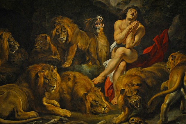
For centuries, artists have been masters of spatial arrangement. Think about a Renaissance portrait: the subject’s position, the angle of their gaze, the objects placed around them, and critically, the negative space surrounding them – all contribute to the mood and narrative. A minimalist painting uses vast expanses of empty space to evoke contemplation or isolation. A bustling street scene uses crowded composition to convey energy and chaos. Artists use composition, perspective, overlap, and the strategic use of negative space (the empty” areas) to create depth, direct the viewer’s eye, and imbue the work with emotional resonance.
Consider the composition of a landscape painting. The placement of a distant mountain range, the winding path in the foreground, the lone tree on the horizon – these aren’t accidental. They are carefully arranged to create a sense of depth, guide the viewer’s eye through the scene, and establish a particular feeling, whether it’s grandeur, serenity, or ruggedness. The empty sky or the expanse of a field are just as important as the objects within them; they provide context and breathing room.
Design: Guiding Action and Understanding
In design, particularly graphic design, spatial arrangement is paramount for communication and usability. A well-designed poster, book cover, or website relies heavily on how elements like text, images, and buttons are organized in space. Whitespace (often misnamed as it’s the *absence* of content, not necessarily white) is a critical tool. It provides visual breaks, separates elements, improves readability, and creates a sense of professionalism and clarity. A cluttered layout overwhelms; a well-arranged one invites engagement.
Think about a magazine spread or a webpage. The size and placement of headlines, the length of text blocks, the positioning of images, the margin sizes – these are all decisions about spatial arrangement. They create visual hierarchy, telling you what’s most important and guiding you through the information flow. Good spatial design makes a complex layout feel intuitive and easy to digest. Bad spatial design makes you work harder to find what you need, leading to frustration.
Whether in art or design, mastering spatial arrangement is about understanding how viewers perceive and interact with visual information. It’s about creating balance, contrast, rhythm, and unity through the thoughtful organization of elements within a defined area. It’s about making things look good, yes, but more importantly, it’s about making them *feel* right and function effectively.