The Color Cycle: A Journey Through Art and Design
In the world of graphics, the color cycle is more than just a sequence of hues; it’s an essential journey that resonates deeply with both artists and designers. The interplay of colors transforms a bland canvas into a vibrant masterpiece, evoking emotions and telling stories without uttering a single word. As we delve into the art of design, let’s explore how the color cycle can ignite our creativity and enhance visual communication.
The Emotional Spectrum of Color
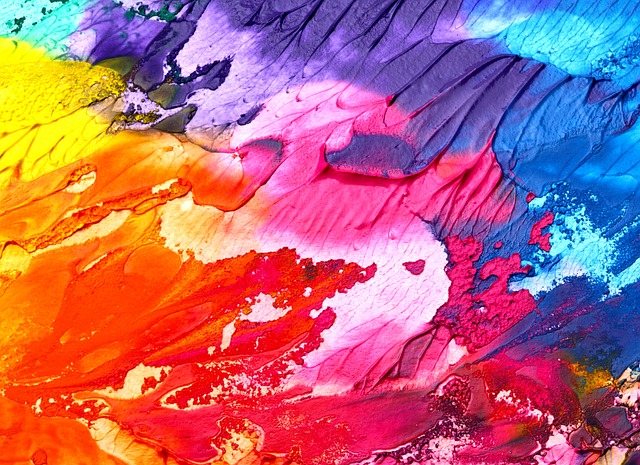
Color has an inherent ability to influence mood and perception. Think about it: a warm palette of reds and oranges can evoke feelings of excitement and passion, while cool blues and greens often instill a sense of calm and peace. By understanding the color cycle, artists and designers can strategically select colors that not only complement each other but also resonate with the intended audience. This knowledge opens the door to creating more impactful and meaningful designs.
The Science Behind the Color Wheel
The color cycle is rooted in the science of color theory. The color wheel, devised by Isaac Newton, is a tool that illustrates how colors relate to one another. It showcases primary, secondary, and tertiary colors, providing a roadmap for effective color selection and combination. By utilizing the contrasting and harmonious relationships unveiled in the color wheel, designers can craft visuals that stand out and captivate the viewer’s attention.
Creating Harmony Through Color Schemes
In design, creating a harmonious color scheme can significantly amplify the deliverance of a message. Complementary colors contrast sharply, often providing vibrancy and energy, while analogous colors create a tranquil, cohesive look. The art of balancing these techniques lies in understanding the color cycle and the emotional impact that each choice may have on the viewer. It’s about finding that delicate equilibrium that satisfies the eye and delights the spirit.
Case Studies: The Power of Color in Graphic Design
Throughout history, iconic brands and successful campaigns have mastered the art of color usage. For example, the bold red of Coca-Cola is synonymous with joy and excitement, perfectly encapsulating the essence of the brand. Meanwhile, the serene blue of Facebook fosters a sense of trust and community. Each design decision hinges upon the calculated application of the color cycle, showcasing how a well-thought-out palette can enhance brand identity and connection.
Adapting to Trends: The Evolving Color Cycle
The realm of design is ever-changing, with color trends shifting as rapidly as fashion. Designers must remain attuned to these changes, adapting the color cycle to resonate with contemporary aesthetics and cultural movements. Keeping abreast of color predictions, like Pantone’s Color of the Year, can be pivotal for graphic designers seeking to remain relevant while ensuring their work aligns with current tastes and trends.
Ultimately, the color cycle is a fundamental aspect of the artistic and design process. It challenges creators to explore, experiment, and ultimately express their visions in ways that connect with audiences on a deeper level. The world of graphics is a canvas waiting to be filled with the beauty and emotion that color brings to the table, urging us all to embrace the vibrant cycles of creativity that lie ahead.