Color is one of the most powerful tools in the world of art and design. It communicates emotions, guides perception, and creates a sense of harmony or chaos. When exploring color dynamics, we navigate the intricate relationship between hues, shades, and the psychological effects they wield on our audience. This journey not only enhances our understanding of color but also refines our design practice.
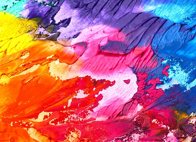
At the heart of color dynamics is the study of how colors interact with each other. Combinations can evoke a plethora of feelings; warm tones like reds and oranges can generate excitement and energy, while cool tones such as blues and greens offer tranquility and calm. Consider how a piece of artwork can change dramatically by simply altering the color palette—this is the crux of understanding color dynamics in design.
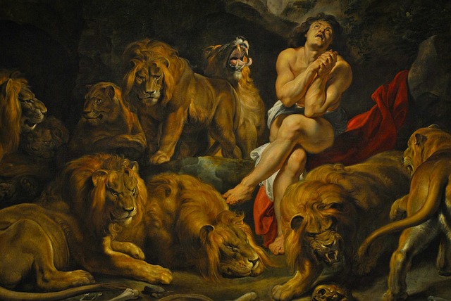
In art, color is often used as a narrative device. Each shade tells a story, and each combination can alter the viewer’s emotional experience. For example, in a painting, deep reds may signify passion or urgency, while softer pastel shades may evoke nostalgia or innocence. As artists and designers, we can leverage these emotional responses to not only enhance the aesthetics of our work but also communicate deeper messages.
A crucial element of mastering color dynamics lies in creating a balanced composition. By juxtaposing contrasting colors or harmonizing complementary ones, we can draw attention to specific elements within a design, providing a visual path for the viewer’s eye to follow. Effective use of color not only establishes a mood but also can emphasize a focal point, making our designs more engaging and impactful.
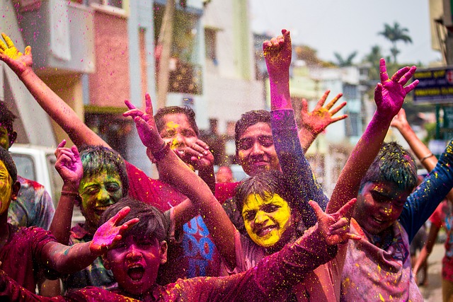
Moreover, cultural context plays a significant role in how colors are perceived and understood. A color that evokes one emotion in one culture may carry a completely different significance in another. This diversity makes understanding color dynamics even more essential for designers who aim for a global audience. It pushes us to research and comprehend the nuances that different colors hold across various cultural landscapes.
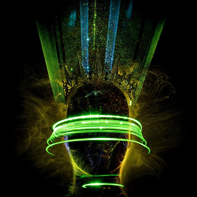
Technology and tools have also dramatically transformed how we approach color dynamics in design. With software like Adobe Color and Procreate, we can experiment with palettes, create gradients, and visualize interactions in ways that were not possible in traditional art forms. This innovation allows us to push boundaries and explore new dimensions of color application in our creative works.
As we dive deeper into the world of color dynamics, it becomes evident how crucial it is for artists and designers alike. It’s not merely about choosing colors; it’s about understanding the essence, emotion, and narrative that colors convey. Whether you are creating a logo, painting a mural, or designing an interface, the synergy of colors can transform the ordinary into the extraordinary. Embrace these principles, and let your artistic vision come to life through the vibrant lens of color dynamics.