Exploring the Power of Color Therapy in Graphic Art and Design
When we delve into the world of color therapy, we uncover a vibrant realm that profoundly influences our emotions, perceptions, and even behaviors. The art of utilizing colors in graphic art and design goes beyond mere aesthetics; it taps into the innate power of color to affect our mental and emotional states. This is not just an art form but a therapeutic practice that resonates with viewers on a personal level.
The Emotional Spectrum of Colors
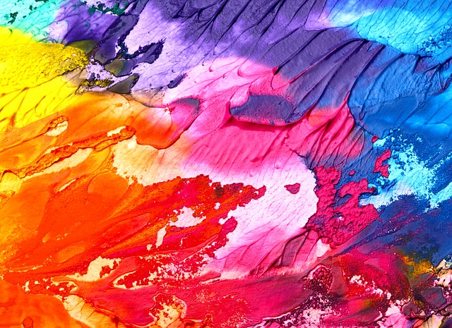
Each color evokes a distinct emotional response. For instance, warm hues like reds and yellows can stimulate energy and creativity, while cooler shades like blues and greens promote calmness and tranquility. By understanding this emotional spectrum, designers can craft experiences that connect with their audience on a deeper level. Whether it’s a soothing blue in a healthcare website or an energizing orange in a fitness brand, the choice of color can make or break the viewer’s engagement.
Integrating Color Therapy in Art
Incorporating color therapy into artistry involves not just choosing colors for their visual appeal, but also understanding their psychological implications. Artists often design pieces that not only reflect their creative vision but also aim to evoke specific feelings. A thoughtful palette can transform a simple illustration into a healing experience, inviting the viewer to explore emotions they may need to address.
The Role of Color in Design
In graphic design, the application of color theory is crucial. Designers leverage color combinations to guide the viewer’s attention and convey messages effectively. A well-placed splash of color can highlight a call-to-action or create a mood that resonates with the target audience. For businesses, harnessing the therapeutic power of colors can enhance brand loyalty and improve user experience, turning fleeting interactions into lasting impressions.
Color Palettes: A Tool for Healing
Choosing the right color palette is akin to selecting the right ingredients in a recipe. The interaction of colors can create harmony or discord, reflecting the intended emotion of the artwork or design. For those seeking to harness color therapy in design, it’s important to experiment with various combinations to discover how they affect both the creation and the viewer. Tools like Adobe Color or Coolors can assist in generating palettes that evoke desired feelings, helping designers tailor their work to specific audiences.
Case Studies in Color Therapy
There are numerous examples of successful implementation of color therapy in graphic art and design. Notably, brands like Starbucks utilize green to symbolize tranquility and sustainability, allowing their customers to feel a sense of calm in a bustling environment. Similarly, social media platforms often rely on colors associated with trust, promoting user engagement and community-building. These strategies highlight how thoughtfully applied color therapy can transcend visual appeal and foster emotional connections.
As we continue to explore the essence of color in art and design, it’s clear that color therapy is more than just a trend; it’s a reflection of our need for emotional connection and well-being through visual experiences. By harnessing this power, artists and designers can create not only beautiful works but also meaningful interactions that resonate with audiences on a profound level.