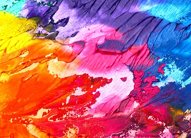
The world of art and design is an enchanting tapestry woven with the threads of color tone. Each hue carries its own emotional weight, creating a spectrum that can inspire, comfort, or even provoke thought. Understanding color tone isn’t merely about selecting shades; it’s about harnessing the psychological power of colors to communicate a message or evoke a specific feeling within the viewer.
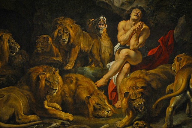
In art, color tone serves as the backbone of a composition. Take a moment to consider the masterpieces that resonate deeply with viewers—notice how the subtle variations in color tone guide our emotions and direct our focus. For instance, an artwork muted in tonal quality can foster a sense of melancholy, while bright, saturated colors can energize the viewer and create an uplifting atmosphere. Artists consciously manipulate color tone to establish a mood, leading us through a complex emotional journey.
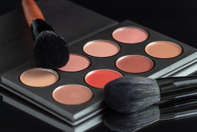
Moving over to design, color tone plays an equally pivotal role. Designers rely on its influence to craft engaging and effective visuals. A carefully chosen color palette with varying tones can enhance branding, ensuring that a company’s identity is not only recognizable but also resonates with the audience’s emotions. The warmth of golden tones can evoke nostalgia whereas cooler tones can present a modern and sleek aesthetic. By marrying colors and their tones, designers can cultivate an overall atmosphere that aligns with the goals of the project—whether that’s to inspire calmness, excitement, or even urgency.
Furthermore, understanding color theory can aid artists and designers in making informed decisions about color tone. The emotional impact of colors is not universal; different cultures and individuals may respond uniquely to certain tones. This is why artists and designers must consider their target audience. Accessibility also plays a role in color tone selection, as legibility and clarity are vital in design. Choosing a color palette that is not only visually appealing but also functional can enhance engagement and comprehension.
In practice, utilizing tools such as color wheels and digital applications can streamline the selection process. These resources allow artists and designers to experiment and visualize how different tones interact, leading to more informed creative decisions. The beauty of color tone is that it can be manipulated to fit a concept, narrative, or even a brand’s personality, opening up a world of possibilities for creative expression.
Ultimately, the exploration of color tone in art and design transcends mere aesthetics; it invites us into a layered conversation with the viewer. By curating our color choices thoughtfully, we can bridge the gap between an artist’s intent and the audience’s interpretation, fostering a deeper connection through the emotional resonance of color. Embrace the power of color tone in your creative endeavors and watch as your work transforms into a vibrant dialogue of its own.