Color is not just a visual experience; it is an emotional journey that transforms the ordinary into the extraordinary. In the world of graphics, mastering the art of design hinges upon the skillful combination of hues, shades, and tones within a carefully curated color scheme. As artists and designers, understanding the psychological impact that colors have on our audience is imperative for effective communication.
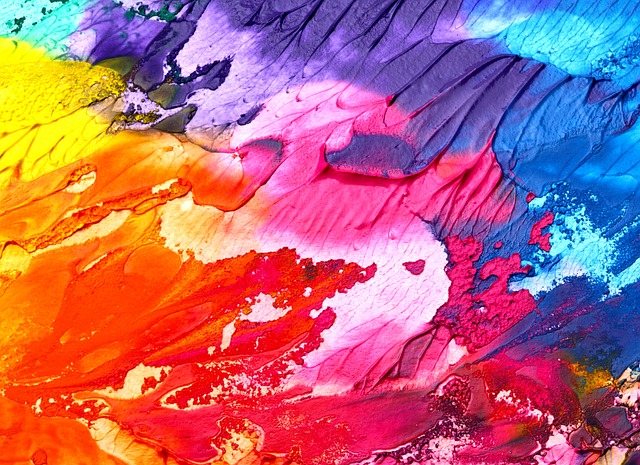
When we first delve into the realm of color, we are struck by its ability to evoke emotions. Bright, saturated colors can instill feelings of joy and energy, while muted tones can create calm and introspection. This dynamic quality of color makes it an essential tool in a designer’s arsenal. For those embarking on the journey of creating a standout graphic, the choice of a color scheme serves as a foundation that guides all design decisions.
Choosing a color scheme is akin to choosing a musical score for a film. It sets the mood and effectively conveys the essence of a narrative. Complementary colors create harmony, while contrasting colors draw attention to key elements. Consider how renowned brands leverage color theory to embody their identities. For instance, the bold red of Coca-Cola elicits excitement and hunger, while the deep blue of Facebook conveys trust and reliability. The right color scheme can encapsulate brand values and resonate deeply with audiences.
The process of selecting a color palette begins with understanding basic color theory. Familiarity with the color wheel allows designers to explore various relationships between colors. Analogous schemes, which utilize colors situated next to each other on the wheel, evoke unity, while triadic combinations can inject liveliness and excitement into a design. While choosing a color scheme, it’s crucial to consider contrast and accessibility to ensure that the design is not just visually appealing but also functional for diverse audiences.
As we plunge deeper into graphic design, we often find inspiration in art history. Renowned artists, from Van Gogh to Monet, have demonstrated the tremendous power of color in their works, evoking specific emotions and narrating stories through their use of paints. These lessons from fine art can be immensely helpful when creating modern graphic designs. Incorporating textures and gradients can mimic the brush strokes of a painting, adding depth and richness to a color scheme.
Finally, don’t shy away from experimentation. The beauty of digital design is its flexibility; numerous design tools and resources enable designers to test and refine their color schemes with ease. Play around with different palettes, and don’t hesitate to seek feedback. Sometimes, the most unexpected combinations yield the most captivating results. Embrace the process as a refreshing journey rather than a rigid formula, and watch as your design transforms before your very eyes.
In the ever-evolving world of graphics, the adventure of mastering color schemes continues to inspire and challenge designers everywhere. By understanding the emotional weight of colors and harnessing their potential, we can create powerful visual narratives that resonate deeply with our audiences. Remember, design is not merely about aesthetic appeal; it’s about crafting a story that connects through the universal language of color.