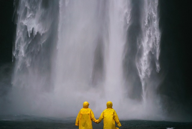
Photography is an incredible medium that transcends mere documentation; it tells stories, evokes emotions, and captures moments in time. One technique that has gained popularity for its ability to enhance visual storytelling is selective color. This artful design approach allows photographers to draw the viewer’s eye to specific elements within a composition, creating an appealing focus that can elevate an ordinary image into an extraordinary piece of art.
Selective color is a compelling tool in the photographer’s arsenal, offering a unique way to manipulate color contrast and saturation. By retaining color in certain areas while rendering the rest of the photo in monochrome, photographers can create a stunning visual effect that heightens the emotional impact of their images. This technique isn’t merely about aesthetics—it’s about transforming how we perceive a scene and inviting viewers to experience it from a fresh perspective.
Imagine a vibrant red umbrella standing out against a backdrop of gray, rainy streets. The selective colors accentuate the umbrella not just as an object, but as a symbol of resilience and warmth amidst gloom. This juxtaposition draws the viewer’s eye directly to the umbrella, implying a deeper narrative of hope and survival. Such powerful imagery becomes possible through the intentional use of selective color, allowing you to weave emotional depth into your photographs.
Incorporating selective color into your photography involves a careful interplay of art and design. It challenges you to think critically about your composition. Which elements carry emotional weight? What story are you telling with your color choices? Start by scouting locations that offer contrasting colors or textures. When you capture your shot, think about how the colors interact; vibrant hues against subdued tones often yield the most impactful images.
The digital age has also made selective color more accessible than ever. With photo editing software and mobile applications, it’s easy to experiment with different levels of saturation and contrast. However, it’s essential to approach this technique with a sense of restraint. Overdoing selective color can lead to images that feel contrived rather than evocative. To maintain authenticity, use this technique sparingly and thoughtfully.
Moreover, think about the message you want your photography to convey when deciding where to apply selective color. For instance, in nature photography, vibrant greens can signify life and vitality, while muted tones can illustrate decay and change. This artistic choice allows you to communicate themes like renewal, transformation, and the passage of time seamlessly. Each photograph becomes a canvas where your ideas come to life through thoughtful color choices.
Ultimately, mastering selective color requires practice and experimentation. Take the time to analyze and reflect on not just what you see, but what you feel when looking at an image. As you develop your own style, consider how your color choices reflect your vision as an artist. Engage with your audience through social media or photography clubs to gather feedback and advice. This collaborative spirit fosters creativity, which is the essence of art and design.
So grab your camera, venture out into the world, and apply the principles of selective color to your photography. Watch as your images transform from simple captures into striking visual narratives that resonate with viewers on a deeper level. Through this bold technique, your photography can truly pop and reflect an artful design that is unmistakably your own.


