Mastering Color Settings for Stunning Photography: A Guide
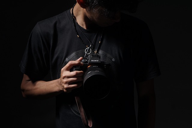
Photography is often described as the art of capturing moments, but what many don’t realize is that it’s equally about capturing the essence of those moments through color. The right color settings can transform an ordinary image into something extraordinary, evoking emotions and creating connections. Whether you’re sharing your work on social media, printing it for yourself, or showcasing it in a gallery, mastering color settings is fundamental to your photographic journey.
Understanding Color Theory
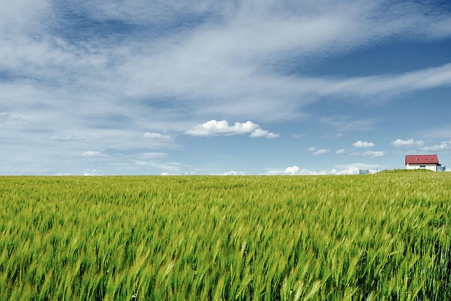
Before diving into the technical side of color settings, it’s essential to familiarize yourself with color theory. Colors invoke feelings: warm tones (reds, oranges, yellows) tend to evoke warmth and energy, while cool tones (blues, greens, purples) often bring a sense of calmness and serenity. Understanding this will help you choose the right palette for your subjects and storytelling.
White Balance: The Key to True Colors
One of the first steps in setting the right colors in your photography is achieving the correct white balance. This setting adjusts the color temperature of your images, ensuring that whites appear white and colors reflect their true appearance. Experiment with different white balance presets or use a custom setting to match the lighting conditions of your environment. Remember, the goal is to keep your images looking natural and appealing.
Exploring Color Profiles
When it comes to digital photography, employing the right color profile can significantly impact how your images are presented. The two most common profiles are sRGB and Adobe RGB. The sRGB profile is perfect for images intended for web use, ensuring consistency across various devices. On the other hand, Adobe RGB offers a wider color gamut, making it ideal for print. Understanding the purpose of your photography will help you decide which profile aligns with your aesthetic vision.
Utilizing Color Grading
Color grading is a powerful tool that allows you to enhance the mood and tone of your images post-capture. By adjusting the hues, saturation, and luminance of specific colors, you can create a unique look that resonates with your style. Programs like Adobe Lightroom and Photoshop offer robust tools for color grading. Spend time experimenting with different settings, as this is where you can truly infuse your personality into your work.
Emphasizing Contrast and Saturation
Contrast and saturation play a pivotal role in how colors are perceived in your photographs. High contrast can create drama and highlight certain elements, while lower contrast tends to deliver a softer, more dreamy aesthetic. Similarly, adjusting saturation levels can either amplify the vibrancy of your images or tone them down for a more muted effect. Balancing these elements is key to drawing attention to the colors that matter in your composition.
Practice with Color Settings
The world of color settings can initially seem overwhelming, but practice is your best ally. Keep experimenting with your camera settings, color profiles, and post-processing techniques. Over time, you’ll develop an eye for what works best for your unique vision. Consider joining photography communities or local workshops to gain insights from fellow photographers and learn different approaches to mastering colors.
Embrace the vibrant world of color in your photography. By understanding and applying the intricacies of color settings, you can elevate your images and convey the emotions you wish to share with your audience. Remember, it’s more than just a photograph; it’s a story told through the colors you choose.