Unlocking the Mastery of Artful Color Pairing in Graphic Design
In the vibrant world of graphics, few elements are as crucial or as evocative as color pairing. It’s more than just combining hues; it’s about weaving harmony, contrast, and emotion into a visual story that resonates deeply with the viewer. For designers, mastering the art of color pairing is like having a secret language—one that speaks directly to both the eyes and the soul.
The Artistic Essence of Color Pairing
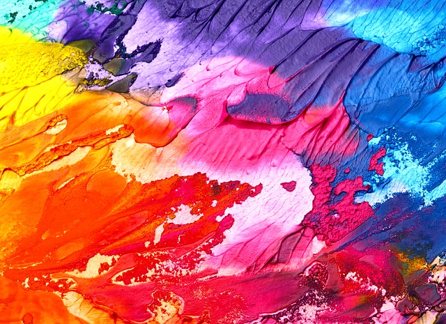
Art, at its core, is about expression and communication. When you step into the realm of graphic design, you become both an artist and a communicator, using color to shape perceptions and evoke feelings. Imagine the calm serenity of blues paired with the energetic vibrancy of oranges—this dynamic contrast not only captivates attention but sparks an emotional reaction that words alone could never achieve.
Designing with Purpose and Passion
Effective color pairing in graphic design hinges on understanding the power of color psychology. Each shade carries its own set of associations and moods: red ignites passion and urgency, green breathes life and growth, while muted tones evoke sophistication and subtlety. The challenge lies in striking a balance—crafting combinations that feel authentic and intentional, rather than chaotic or forced.
From Theory to Practice: Bringing Color Pairing to Life
Successful designers often draw inspiration from nature’s palettes or from cultural traditions, blending colors that naturally harmonize or boldly contrast to create impact. Tools like color wheels and online palette generators can guide you, but the true mastery comes from developing an intuitive sense of what feels right. This emotional connection to color pairing transforms your work from mere visuals into immersive experiences.
Why Mastery of Color Pairing Matters in Graphics
In a crowded visual space, a well-executed color palette can make your design instantly recognizable and memorable. It helps establish brand identity, guides the user’s eye, and can even influence purchasing decisions. Whether you’re crafting a sleek logo, an eye-catching poster, or a dynamic website, your choice of colors and their pairing can elevate the design from simple decoration to powerful storytelling.
Ultimately, artful color pairing becomes an act of choreography between hues—each dance step carefully considered, each tone thoughtfully placed to engage, inspire, and move the audience.