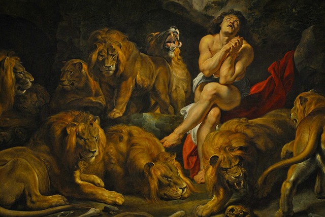
Inspiring Artistry: Unleashing the Power of Color Invocation in Design
In the world of graphics, where every pixel and brushstroke tells a story, the concept of color invocation stands as a vibrant beacon of creativity and emotion. Color is far more than just a visual element; it is a powerful tool that can evoke feelings, convey messages, and transform ordinary designs into unforgettable masterpieces.
The Emotional Language of Color
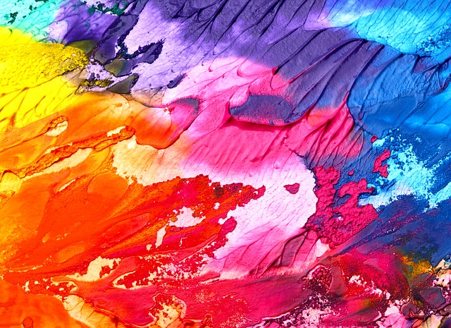
Art and design share a unique relationship with color. When artists invoke color skillfully, they tap into an innate emotional language that speaks directly to the viewer’s heart. Warm hues like reds and oranges ignite passion and energy, while cool blues and greens evoke calmness and tranquility. This practice of carefully selecting and combining colors is what we call color invocation, and it is essential for creating designs that resonate.
From Canvas to Screen: The Evolution of Color Invocation
Traditionally, artists have harnessed color invocation to bring their visions to life, mixing pigments on canvas to produce depth and feeling. Today, designers apply these principles digitally, leveraging tools that allow for infinite experimentation with shades, tones, and contrasts. This evolution has expanded the possibilities, making color a more dynamic and influential part of graphic design than ever before.
How Designers Harness Color Invocation
Successful design is rooted in understanding how colors affect human perception and behavior. Designers use color invocation to:
- Set the Mood: Colors can create an atmosphere that aligns with the brand’s identity or the artwork’s narrative.
- Guide Attention: Bold colors direct viewers to key elements within a design.
- Enhance Readability: Strategic color contrasts improve user experience by making text and images easier to digest.
- Invoke Memories: Certain colors can trigger personal or cultural memories, deepening the connection to the design.
Practical Tips for Embracing Color Invocation
To truly unleash the power of color invocation in your art or design projects, consider the following:
- Study Color Psychology: Understanding the emotional impact of colors helps you make intentional choices.
- Experiment Boldly: Don’t shy away from unexpected combinations that challenge traditional palettes.
- Use Contrast Wisely: Play with light and dark colors to create visual hierarchy.
- Keep the Audience in Mind: Tailor your color schemes to the preferences and expectations of your target viewers.
A Call to Bold Creativity
Whether you’re an artist painting your next masterpiece or a designer crafting a compelling brand identity, embracing the practice of color invocation opens a gateway to expressive and impactful work. By merging the emotional depth of art with thoughtful design techniques, you can inspire connection, provoke thought, and celebrate the extraordinary power of color.