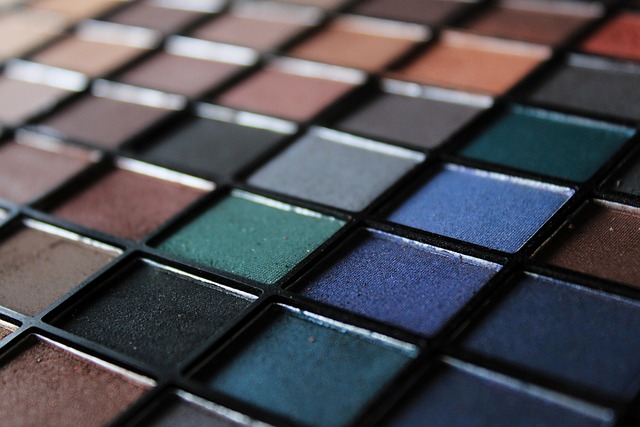
Color is more than just a visual element; it is an emotion, a narrative that unfolds with every image captured. When it comes to photography, understanding the power of a well-crafted color palette can radically transform your work, providing depth, cohesion, and storytelling. The artistry of color palettes goes beyond mere aesthetics; it marries the principles of art and design into a harmonious balance that resonates with the viewer.
Imagine stepping into a gallery filled with photographs. Each piece vibrates with its own emotional undertone, largely dictated by its color scheme. A soft, pastel palette evokes feelings of tranquility, while a bold, saturated color palette can elicit excitement or passion. As photographers, we wield the creative power to manipulate these emotions through intentional selection of colors.
The foundation of any compelling photograph often lies in its color palette. A well-considered palette allows for seamless visual narratives. When choosing colors, think about the mood you want to convey. Are you drawn to the calming effect of a cool color scheme, with shades of blue and green that remind one of tranquil waters? Or are you more inclined towards warm reds and yellows that embody energy and warmth? These choices shape not only how viewers perceive individual images, but also how they interpret the overarching theme of a series.
Design principles play an integral role in establishing a cohesive color palette. The concept of color harmony—complementary, analogous, or monochromatic—guides photographers in selecting colors that work well together. For example, an analogous color scheme, which involves colors that are next to each other on the color wheel, creates a serene and unified feel, perfect for landscapes or nature photography. Conversely, a complementary palette, which contains colors opposite each other, can inject dynamism into a portrait, highlighting the subject against a dramatic backdrop.
Additionally, the emotional and psychological aspects of colors cannot be overlooked. Colors have the unique ability to invoke specific feelings and memories; for instance, blues often convey calmness and professionalism, while oranges and reds can stimulate appetites and energy. Understanding these associations enables photographers to elicit desired responses from the audience, guiding their viewing experience from the first glance to a deeper engagement with the imagery.
Experimentation is key when it comes to mastering your own color palettes. Use color grading techniques during post-processing to refine how your colors interact within each frame. Tools like Adobe Lightroom and Photoshop allow you to fine-tune hues and saturation, creating mood that resonates with your creative vision. By embracing a playful attitude toward color, you can discover new dimensions in your photography that reflect your unique perspective.
Ultimately, creating a remarkable color palette is about marrying technical skill with intuitive artistry. As photographers, we need to embrace our roles as visual storytellers, utilizing color not just for the sake of beauty, but as a medium for expression. Delve into the psychology of color, explore various schemes, and let your feelings guide your creative journey. Remember, your camera captures the world around you, but it’s your color palette that will breathe life into your vision.


