Exploring the Beauty of Pale Hues in Painting
The world of painting is a vast tapestry of colors and textures, each hue telling a story and evoking emotions. Among these myriad shades, pale hues often emerge as delicate whispers that can transform a canvas into a tranquil haven. Whether it’s the soft blush of a peach or the serene coolness of a sky blue, these understated colors invite the viewer to pause and reflect.
Pale shades possess an innate ability to create harmonious compositions. They exude a sense of calmness and serenity, making them ideal for settings that seek to evoke peace and tranquility. Consider a landscape painted in gentle pastels; the subtle interplay of light and shadow creates an ethereal atmosphere, drawing the observer into a serene escape. Each stroke captures the essence of simplicity, reflecting the beauty of nature in its softest form.
In addition to landscapes, pale hues hold their own in portraiture. A portrait painted in delicate tones can convey a profound tenderness. The soft blush of a cheek or the faintest hint of color in a garment can reveal layers of emotion, allowing the viewer to connect with the subject on a deeper level. These understated colors breathe life into the canvas, producing an intimate dialogue between the artwork and the observer.
The versatility of pale hues also extends to abstraction. Artists can utilize these subtle shades to express complex themes with a light touch. In abstract works, pale colors can create a sense of depth and space, inviting the viewer to explore the canvas more closely. As the eye moves across the painting, the gentle transitions between colors evoke feelings of nostalgia and introspection.
Let’s not forget the psychological impact of color. Pale tones are often associated with openness and calmness, making them essential in creating spaces that foster creativity and contemplation. Imagine a studio awash in soft, pale colors; the soothing environment encourages artistic exploration and the freedom to experiment without overwhelming distraction.
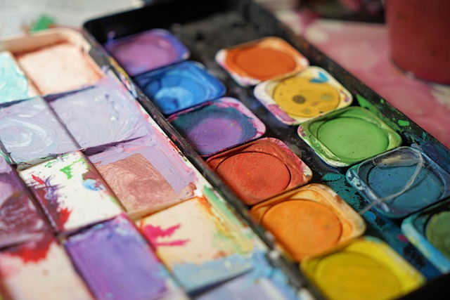
Incorporating pale colors into your own artwork can be a rewarding journey. Experimenting with watercolor or acrylics in lighter shades can unleash a world of softness and gentleness. Layering pale colors can create a stunning depth, allowing the subtle nuances of light to dance across the canvas. Don’t be afraid to let these colors take center stage or to use them as understated backgrounds to make bolder hues pop.
It’s important to remember that the beauty of pale colors lies in their ability to inspire and evoke emotion. Whether you’re an artist or an admirer of art, take a moment to appreciate the beauty and tranquility that pale hues bring. Explore their potential and allow yourself to be enveloped in their serene embrace. Every brushstroke can tell a story, and with pale colors, those stories can often be the most poignant of all.