Color is an essential element in graphic design, acting as a powerful tool to convey emotions, set moods, and create harmony within a composition. As a graphic designer, understanding how to create artful palettes can elevate your work and provide a visceral experience for your audience. In this guide, we’ll explore the intricacies of crafting effective color palettes and the impact of color on art and design.
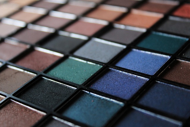
When we think of a palette, we often envision a harmonious blend of colors that work together to evoke specific feelings. Whether it’s the vibrant hues of a sunset or the muted tones of a misty morning, each color evokes a unique response. In design, selecting the right colors for your palette is crucial in guiding viewers’ emotions and influencing their perceptions of your work.
The Psychology of Color
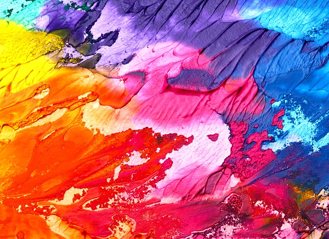
Colors have a psychological significance that can subtly influence how viewers relate to your work. For instance, warm colors like red and orange can evoke feelings of energy and passion, while cool colors like blue and green tend to promote calmness and tranquility. Understanding the emotional weight of different colors allows you to choose a palette that aligns with the message you intend to convey in your art.
Choosing Your Palette
Creating a cohesive palette can initially feel daunting. Here are some tips to help you get started:
- Start with a Base Color: Choose a primary color that resonates with your project’s theme. This will serve as the foundation for your palette.
- Use Color Theory: Familiarize yourself with the color wheel. Complementary colors can create striking contrasts, while analogous colors provide a harmonious flow.
- Limit Your Palette: Less can be more. A limited palette often leads to a more visually appealing design, allowing important elements to shine through.
Experimentation Is Key
Don’t hesitate to play with different shades, tints, and tones to find the perfect combination. Tools like Adobe Color, Paletton, or Coolors can aid in visualizing your palette options. The beauty of design lies in its subjectivity, so feel free to experiment until you discover a palette that feels right for your project.
Application in Your Work
Once you’ve created your ideal palette, think about how to implement it effectively in your designs. Consistency is vital. Using your colors strategically across different elements—typography, backgrounds, and graphics—will create a unified look that draws the viewer in.
Color in Branding
In graphic design, color also plays a pivotal role in branding. A well-thought-out palette can define a brand’s identity and make it instantly recognizable. Consider how brands like Coca-Cola, Starbucks, and Tiffany & Co. use distinct color combinations to evoke certain feelings and associations. When designing for a brand, ensure that the colors align with its mission and values, reinforcing the overall message.
Ultimately, unlocking the power of color through thoughtful palette creation can lead to stunning visual results. Whether you’re designing a logo, a poster, or an entire website, remember that color is more than just aesthetic; it’s an essential part of storytelling in art and design. Let your imagination run wild, explore various combinations, and watch as your designs come to life in vibrant ways.


